Wayfarer

Project Overview
Wayfarer is a travel discovery platform designed to help users find unique destinations, hidden gems, and personalised recommendations. When I began this project, the challenge was to design a fully responsive homepage experience that felt modern, inspiring, and effortless to explore. The result is a clean, intuitive, and visually balanced experience across desktop, tablet, and mobile — built through structured UX thinking, careful iteration, and deep attention to detail.
Client:
Wayfarer
Year:
2025
Category:
UX Strategy / Product Website / Branding
/
Travel discovery platform
Location:
London, Uk
The Challenge
The initial problem
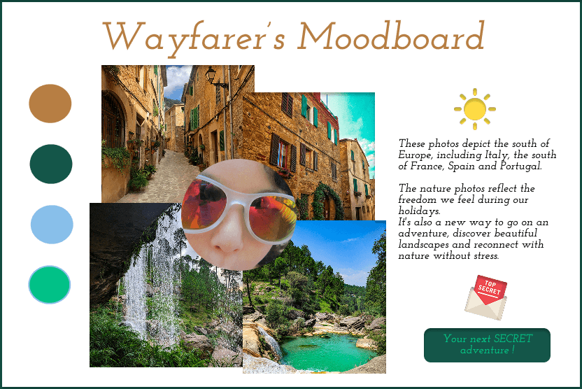
01. Initial exploration — moodboard
My process started with a moodboard inspired by warm landscapes, natural textures, and the colours of Southern Europe — Italy, France, Spain, Portugal.
This early exploration set the emotional tone:
warm, sunlit palettes
nature-driven imagery
a sense of adventure and freedom
Later in the process, the visual direction evolved significantly, becoming more refined and aligned with Wayfarer’s brand personality.
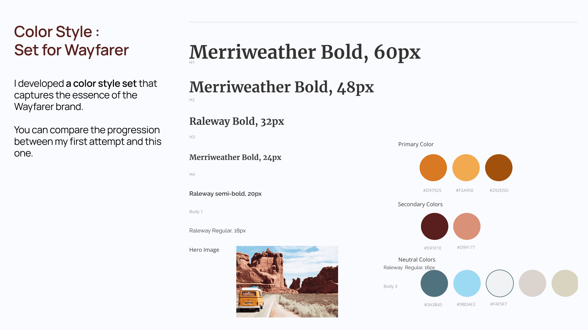
02. Visual identity — colors & typography
I created a polished colour and typography system that became the backbone of the UI design.
Typography
A pairing of Merriweather (serif) and Raleway (sans-serif) creates a balance between:
editorial elegance (titles)
modern usability (body content)
Color Palette
Primary colours: warm terracotta tones inspired by desert landscapes
Secondary colours: earthy reds and soft pinks
Neutrals: slate blue, light cream, and soft grey
This system created a cohesive brand voice and guided all interface decisions.
The Key constraint
Designing an experience that evokes emotional inspiration and a sense of discovery while remaining highly intuitive, scalable, and easy to navigate across all devices.
Travel content tends to be visually rich and emotionally driven, which can easily overwhelm users or create cognitive overload if not structured clearly.
The challenge was to make inspiration feel effortless — encouraging exploration without users feeling lost or unclear about how to begin their journey through the product.
This constraint shaped the project at every step, including:
Choosing emotional direction and visual tone (warm palettes, sense of adventure) that appeal to aspirational motivations, without sacrificing clarity.
Designing the homepage structure so users instantly understand what Wayfarer offers and how to interact with it.
Creating a responsive layout that feels natural on desktop, tablet, and mobile while preserving that balance between exploration and orientation.
N — Neuro-Understanding
(Applied Neuroscience & Cognitive Psychology)
Constraint at this stage
Emotional imagery and storytelling stimulate curiosity and dopamine, but too much stimulus increases cognitive load and causes users to disengage.
UX Strategy
Analyze how users scan emotionally rich content
Control attention through visual hierarchy and rhythm
Use whitespace and pacing to let emotions land without overload
Apply narrative sequencing to sustain curiosity without chaos
Outcome
✔ Clear emotional mental models
✔ Design principles balancing excitement and calm
E — User Exploration
(UX Research & Behavioral Insights)
Constraint at this stage
Users browse travel content in exploratory mode, but still need subtle orientation and control.
UX Strategy
Identify moments where users shift from inspiration → intention
Map emotional journeys, not just functional tasks
Observe where users feel lost vs. engaged
Prioritize orientation moments within the flow
Outcome
✔ Emotional user journeys
✔ Identified friction points where inspiration turns into confusion.
U — Brand Unification
(Brand Strategy & Experience Alignment)
Constraint at this stage
Brand expression risks overpowering usability if not disciplined.
UX Strategy
Define brand personality boundaries (poetic but grounded)
Align tone, visuals, and motion with cognitive clarity
Ensure emotional expression never competes with navigation
Outcome
✔ A cohesive emotional universe
✔ Brand presence that supports — not replaces — UX structure
R — UX Resolution
(Information Architecture & Prototyping)
Constraint at this stage
Story-driven layouts can easily break orientation if IA is weak.
UX Strategy
Structure content in progressive layers
Design IA that supports exploration without dead ends
Create wireframes balancing immersion and direction
Test prototypes for “Do I know where I am?” clarity
Outcome
✔ Navigable storytelling experience
✔ Users feel guided, not pushed
O — Ongoing Optimization
(Iteration & Experience Refinement)
Constraint at this stage
Emotional engagement can fade if pacing or density isn’t tuned.
UX Strategy
Observe scroll behavior and attention drop-offs
Adjust spacing, transitions, and content density
Optimize the balance between immersion and action
Iterate based on qualitative feedback
Outcome
✔ Refined experience flow
✔ Sustained engagement without fatigue
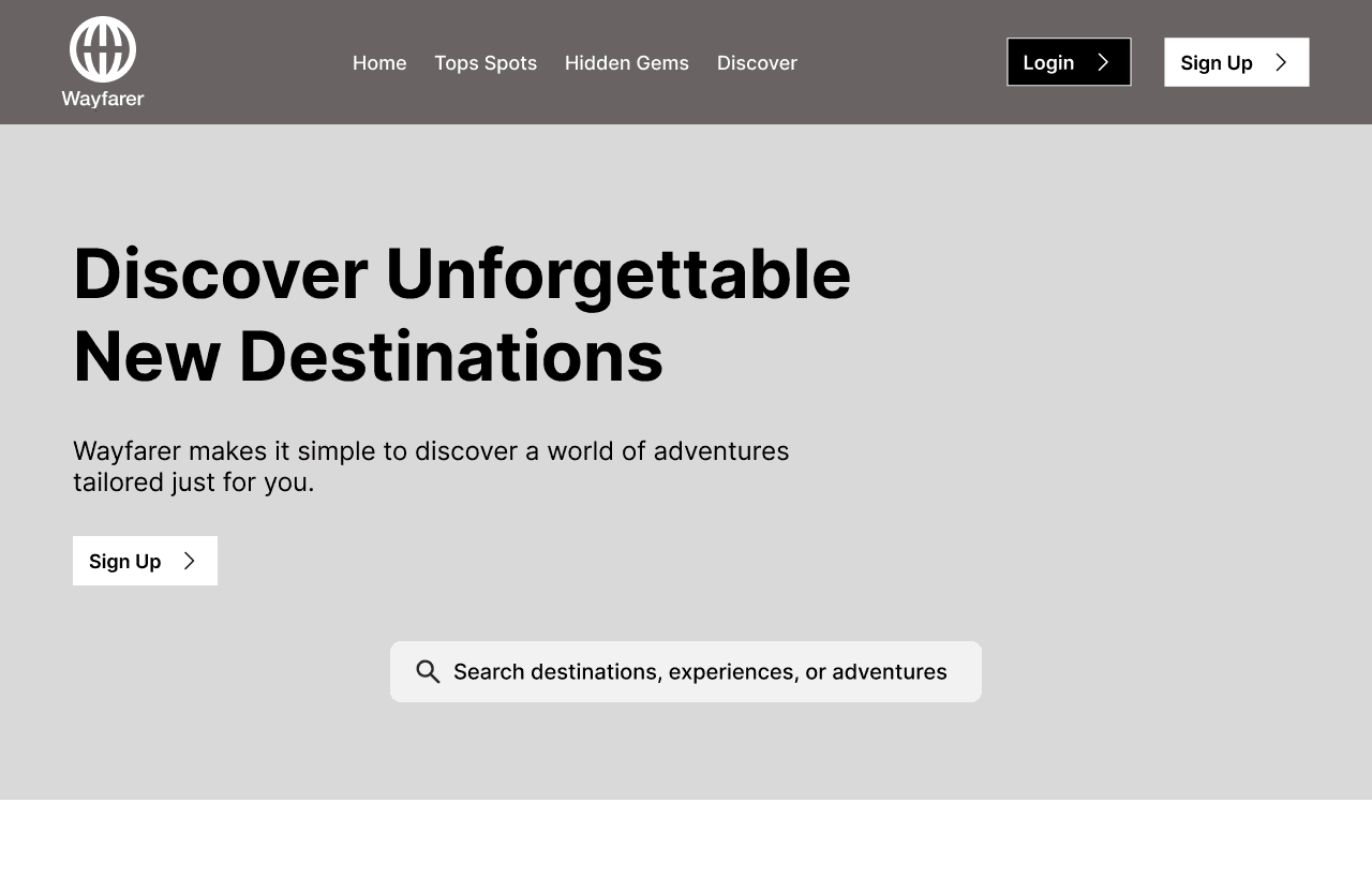
The Solution
UX Solution — Clarity-First, Trust-Driven Design
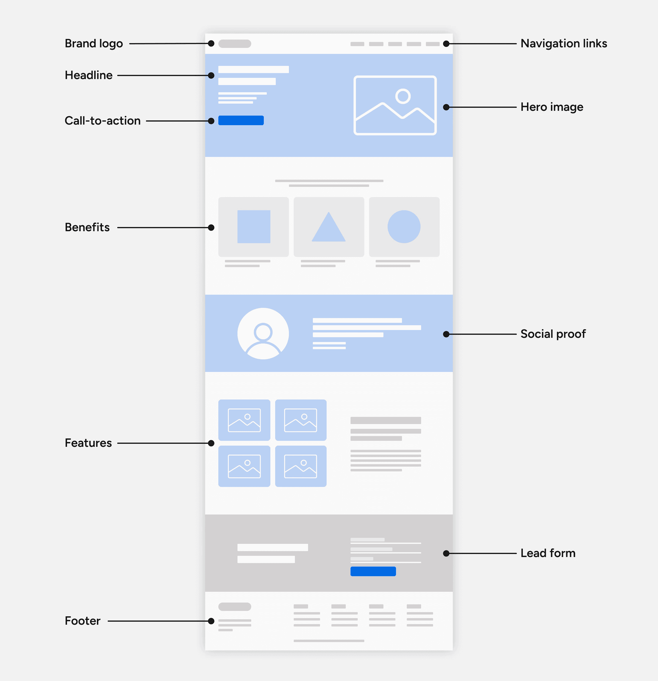
03. UX foundation — wireframing the homepage
Key UX decisions included:
a strong hero section with a clear value proposition
simplified navigation with intuitive categories (Top Spots, Hidden Gems, Discover)
a visually prominent search bar
alignment, spacing, and layout consistency
You noted that this stage helped you overcome challenges with auto-layout, components, and responsive frame structure — resulting in a more professional, scalable design system.
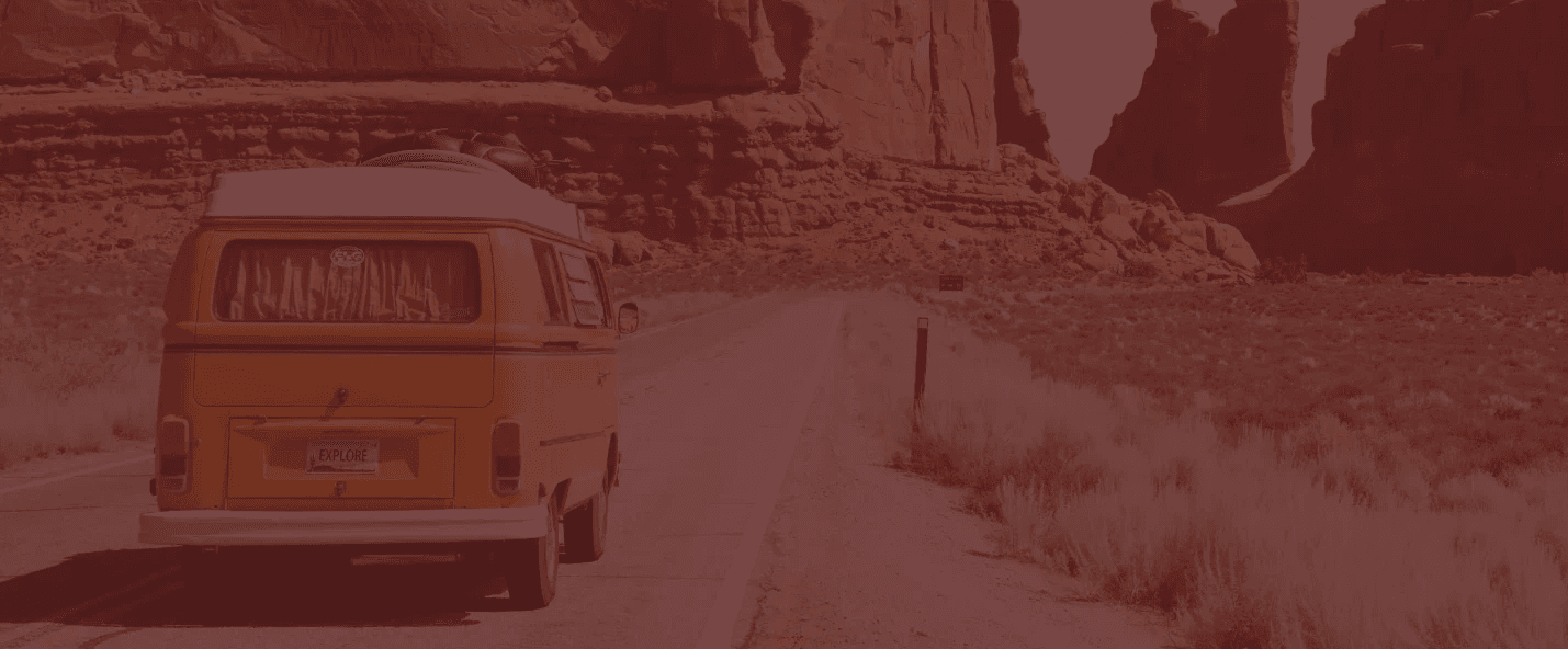
04. Responsive layout — desktop, tablet & mobile
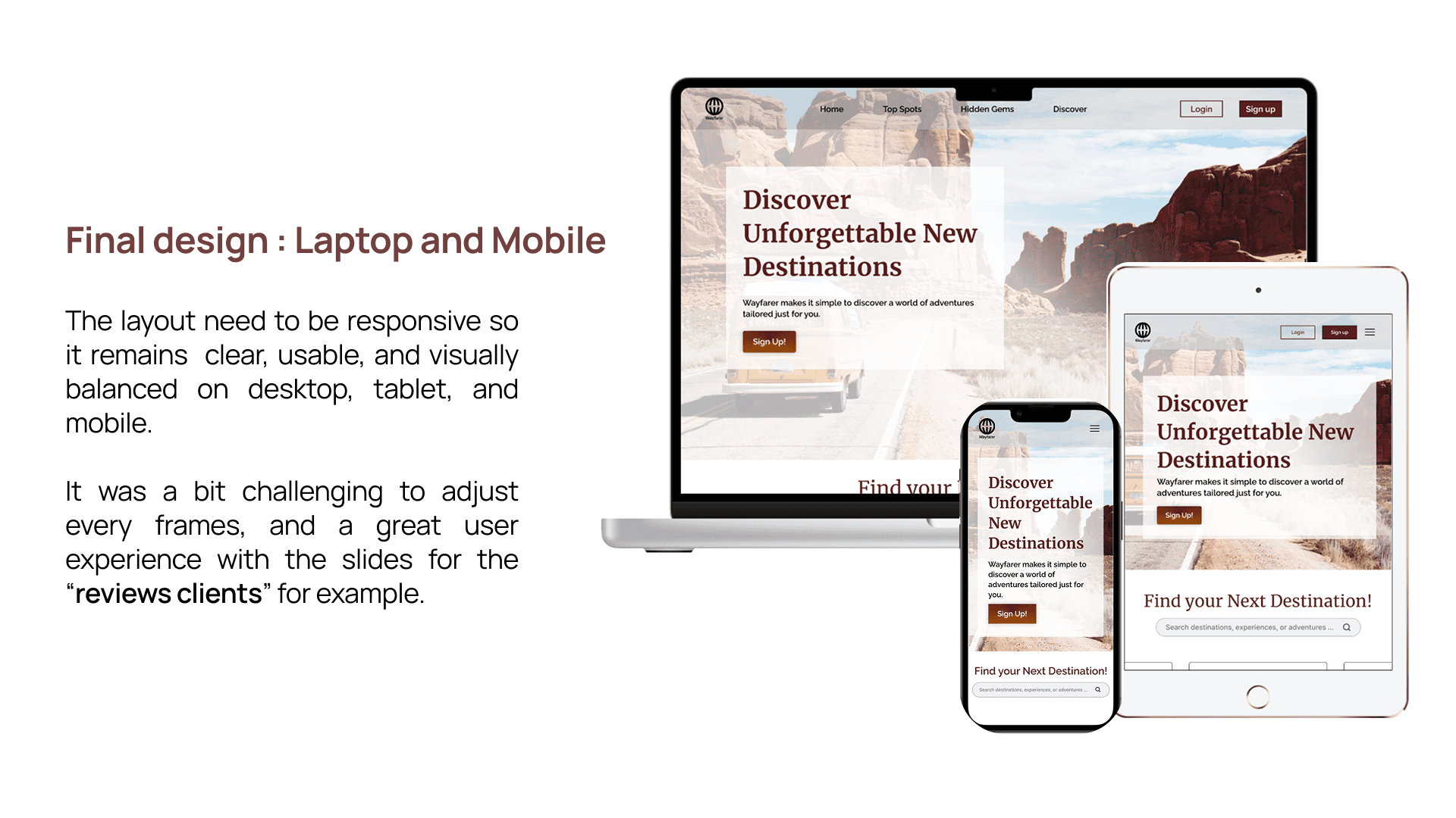
Desktop
strong hero banner
clearly structured sections
balanced use of imagery and text
well-spaced content blocks
Tablet
adapted layout to maintain readability
reduced density for visual comfort
Mobile
vertical stacking for natural flow
thumb-friendly interactions
simplified sections for clarity
Creating consistency across all breakpoints required several rounds of refinement, especially around margins, spacing, and typography.
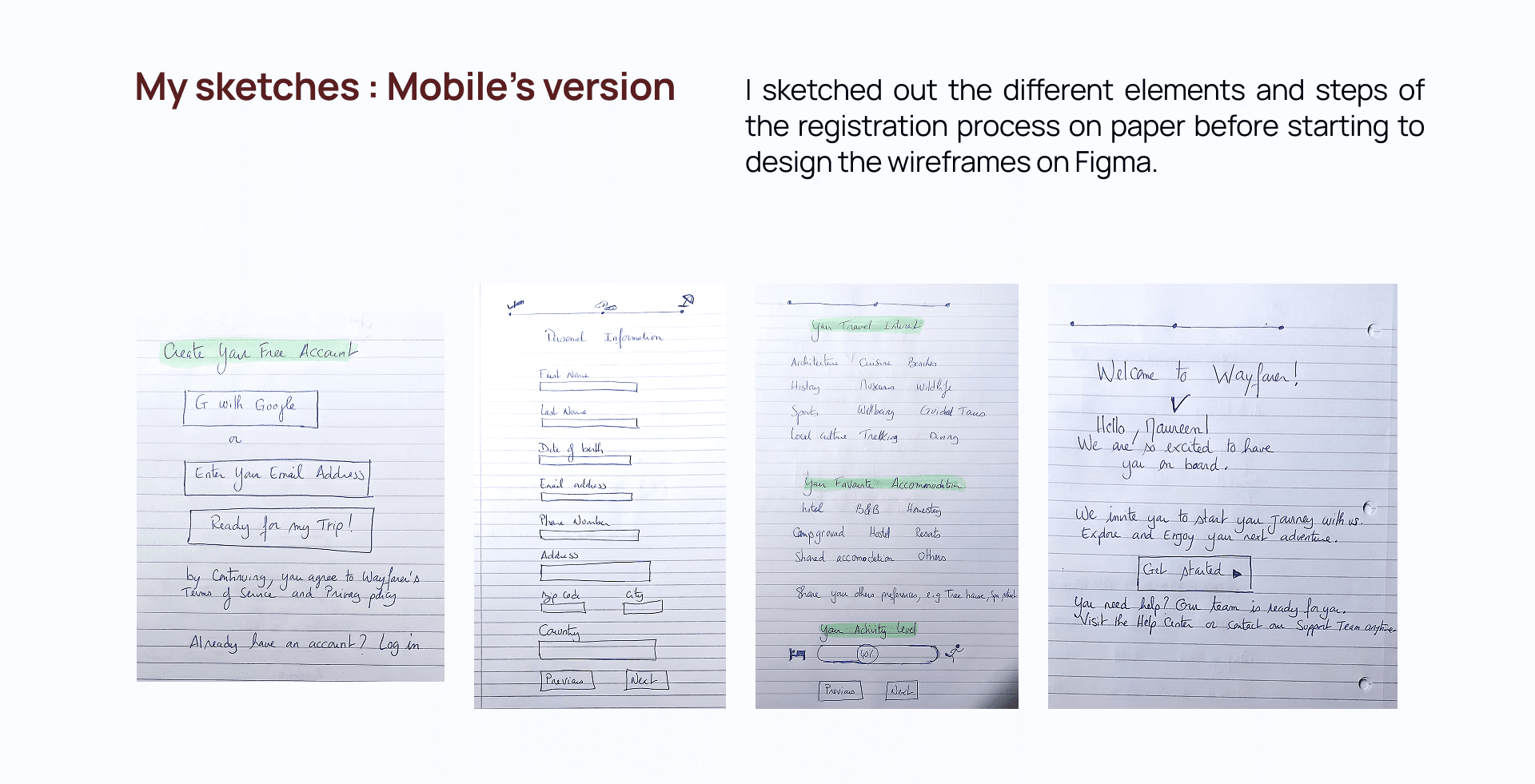
05. Early UI thinking — paper sketches
These sketches include:
account creation screens
personal information flow
accommodation preferences
user onboarding messages
Sketching helped you quickly explore several layout options before committing to Figma frames.
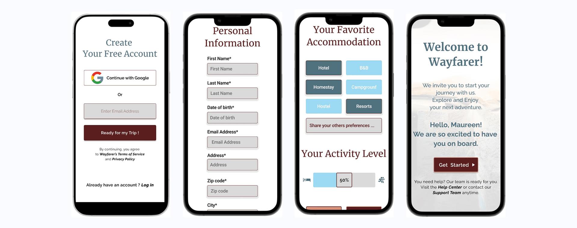
06. Mobile registration flow — enhanced usability
I was focused on:
consistent button sizing
smoother step-by-step flow
clear form fields
an inviting onboarding message
This stage demonstrates your ability to evaluate early UI decisions, identify issues (such as inconsistent button size), and refine them to enhance the mobile user experience.

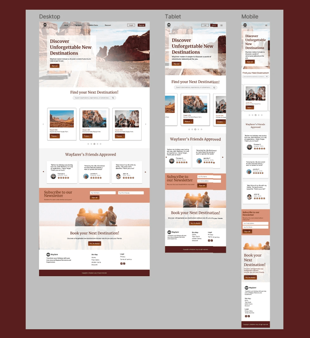
07. Final design — a cohesive multi-device experience
The final result demonstrates:
harmony between branding and UX
refined layout structure
improved visual hierarchy
alignment and spacing consistency
a professional, polished design style
The Result
Conclusion of the Case Study Through this project, you strengthened essential UX/UI skills: - Design System Thinking - Creating a consistent colour, type, and component structure. - Responsive Design Mastery - Balancing clarity and usability across desktop, tablet, and mobile. - Attention to Detail - Refining alignment, spacing, and visual rhythm — crucial for polished interfaces. - Iterative UX Mindset - Sketch → Wireframe → UI → Refinement → Final Design. FINAL WORDS Wayfarer represents your ability to: - craft a meaningful visual identity - structure clear and intuitive user flows - design responsively with precision - follow a professional UX process end-to-end - iterate and polish at a senior level This project showcases your growth, your UX maturity, and your ability to create beautiful, usable, and professionally structured digital experiences.
Client feedback
She demonstrated a strong grasp of UI design principles, visual design fundamentals, and Figma proficiency. Her background in art direction clearly informed her work, bringing creativity and polish to each project. What impressed me most was her ability to give thoughtful design critiques and communicate her decisions clearly.

Charlie Titherley
,
AI Development Training & Consulting

