Drone
AIRWORKS
Project Overview
Role: End-to-End Product Designer (Branding, UX/UI, Development)
Client:
Drone AIRWORKS
Year:
2022
Category:
UX Strategy / Product Website / SEO
/
Drone
Location:
Frejus, France

The Challenge
The initial problem
1. The challenge
Jérôme Descôtes, a veteran with 15 years in commercial communication, pivoted to professional drone piloting. While his technical skills and background in communication were strong, "Drone Airworks" was a brand new entity with zero digital footprint.
The Design Problem: How do we translate the client's core values—rigour, humility before nature, and technical precision—into a digital brand that immediately establishes trust with high-value B2B clients (Real Estate, Corporate, Tourism) who are sceptical of amateur drone operators?
Initial analysis identified several friction points:
Highly technical offerings difficult to understand for non-expert decision-makers
Lack of clear differentiation between services and use cases
Trust signals (certifications, expertise, compliance) not immediately visible
A navigation structure driven by internal logic rather than user intent
UX Hypothesis
In a high-risk, technical industry, clarity + authority + reassurance drive conversion more than visual complexity or marketing language.
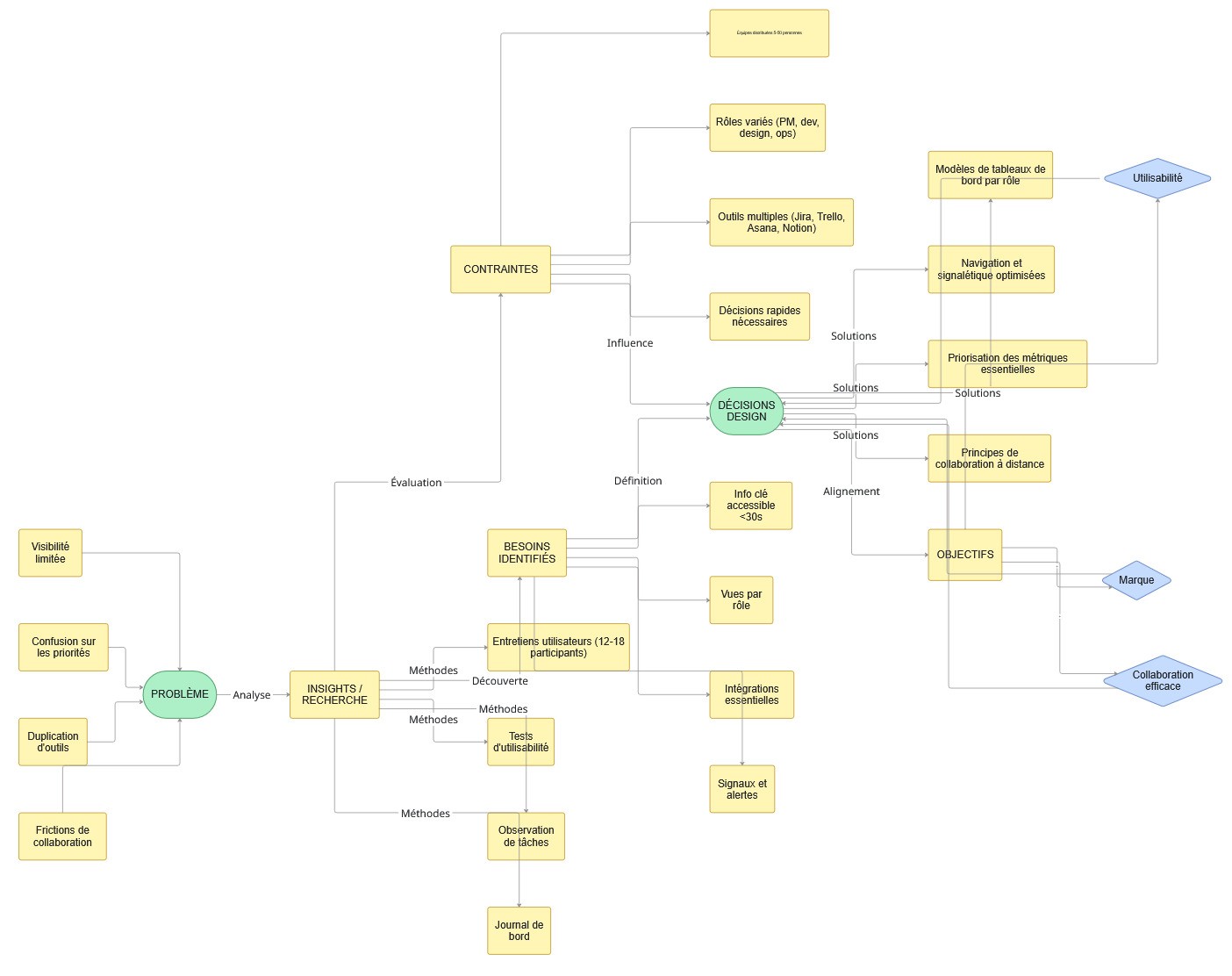
UX thinking: user understanding → constraints → design decisions aligned with brand and usability goals.
Methodology — The N.E.U.R.O. Method
A proprietary UX framework combining neuroscience, user research, brand strategy, and performance optimization.
N — Neuro-Understanding
(Applied Neuroscience & Cognitive Psychology)
Objective
Understand how professional users evaluate risk, credibility, and expertise under time pressure.
Actions
Cognitive analysis of trust formation in B2B and safety-critical contexts
Reduction of cognitive load through structured information and clear hierarchy
Use of authority bias, familiarity cues, and recognition patterns
Strategic placement of reassurance elements (certifications, experience, compliance)
Deliverables
✔ Mental models of decision-makers
✔ Cognitive friction analysis
✔ UX clarity roadmap
E — User Exploration
(UX Research & Data)
Objective
Identify real user expectations across different professional profiles.
Actions
Mapping primary user types (industrial clients, local authorities, professionals)
Identification of key questions users need answered before making contact
Analysis of drop-off points in the existing navigation
Prioritization of user needs by decision impact
Deliverables
✔ Personas
✔ User journeys
✔ Prioritized informational needs
U — Brand Unification
(Brand Strategy & Experience Alignment)
Objective
Align the UX with a brand positioned around precision, reliability, and professionalism.
Actions
Definition of a clear, confident, no-nonsense tone of voice
Visual alignment with industrial and technical standards
Consistent presentation of expertise, safety, and compliance
Deliverables
✔ Design language system
✔ Visual consistency across touchpoints
✔ Brand perception alignment
R — UX Resolution
(Information Architecture & Prototyping)
Objective
Transform complex services into a navigable, confidence-building experience.
Actions
Restructured information architecture around use cases, not internal services
Clear segmentation of offerings by user intent
Simplified navigation paths with explicit next steps
Wireframes and prototypes tested for clarity and comprehension
Deliverables
✔ Validated UX structure
✔ Conversion-oriented user flows
✔ High-fidelity functional prototype
O — Ongoing Optimization
(Data, Testing & Iteration)
Objective
Continuously improve clarity and conversion after launch.
Actions
Monitoring engagement and contact funnel performance
Iterative optimization of service descriptions
Refinement of trust signals based on user behavior
Continuous UX adjustments driven by data
Deliverables
✔ Optimized versions
✔ Measurable performance improvements
2. Brand strategy & identity
Before touching a pixel on the screen, I established a visual language that balanced technical precision with artistic fluidity.
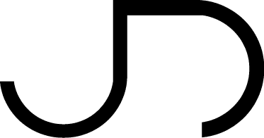
The Monogram (Logo): I designed a continuous-line monogram combining the initials "J" and "D". The geometry mimics the trajectory of a drone in flight—loops and smooth banking turns. It is minimalist and enclosed, representing control and safety.
Typography:
Primary: A clean, geometric Sans-Serif for the brand name to convey stability and modernity.
Secondary: A handwritten script font for the tagline "Vos projets méritent un drone" (Your projects deserve a drone). This adds a human touch, bridging the gap between the machine (drone) and the emotion (the resulting video).
Color Palette: A stark Black & White identity was chosen to act as a "gallery frame." This ensures the brand never competes with the colorful aerial imagery, but rather elevates it.
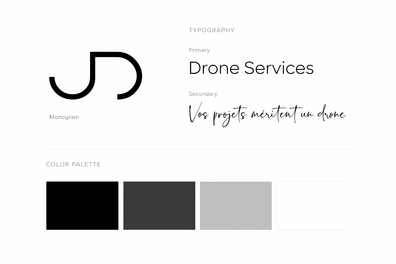
Visual identity — colors & typography
3. UX/UI design (the digital experience)
The website needed to be more than a brochure; it needed to be an immersive viewing experience.
The "cinematic" user interface
Dark Mode by Default: For the homepage, I utilized a high-contrast black background. In UI theory, dark backgrounds reduce eye strain and increase the perceived saturation and vibrance of photographs/video. This simulates a cinema environment, keeping the user focused solely on the content.
Immersive Hero Section: The homepage opens with the tagline and a massive visual area, immediately validating the value proposition: high-quality imagery.
Information architecture & user flow
Segmented Service Offerings: Recognizing that a Real Estate agent has different needs than a Tourism Board, I structured the "Prestations" (Services) section into clear, distinct cards. This reduces cognitive load, allowing users to self-select their user journey immediately.
Trust Signals: The design highlights the pilot's "humility and rigor" (from his bio) by presenting the content in a clean, grid-based layout. The lack of clutter signals professionalism and adherence to regulations—a key pain point for companies hiring drone pilots.
Early wireframes used to validate information hierarchy.
4. The "phygital" experience (business cards)
I extended the UX beyond the screen. The business cards were designed as mini-portfolios.
Recto (The Business): Minimalist, white, information-heavy. It speaks to the "Ex-Communication Sales" side of the client—efficient and clear.
Verso (The Art): A full-bleed aerial shot of the beach. It provides an immediate tactile example of the product. When the client hands over a card, he is handing over a piece of art.
Business Card (Front / Back)
5. Outcome & reflection
By building the brand from scratch, I ensured consistency across every touchpoint.
The resulting identity positions Drone Airworks not as a freelance gig, but as a premium agency partner for corporate communication. The design successfully bridges the client's experience in negotiation with his new technical expertise.
The Key constraint
How to build immediate trust and professional credibility for a brand with zero digital footprint in a high-trust, technical B2B market.
In more detail:
Drone Airworks was a brand-new business created by a seasoned professional pilot transitioning from commercial communication into drone services. Despite strong individual expertise, the company had no existing online reputation, no client testimonials, and no industry presence—yet it needed to convince high-value B2B clients (Real Estate, Corporate, Tourism) that it was legitimate, safe, and technically reliable from the very first interaction.
User flow simplified to reduce cognitive load.
The Solution
UX Solution — Clarity-First, Trust-Driven Design
A. "High-Altitude" Digital Ecosystem
To position Drone Airworks as a premium partner for corporate and industrial clients, I developed a cohesive brand ecosystem that balances technical precision with cinematic beauty. The solution moves beyond a simple portfolio site; it is a trust-building platform.
Reframed User Journey
The experience was redesigned to follow how professionals actually decide:
Immediate credibility (certifications, expertise, compliance)
Clear understanding of use cases
Reassurance around safety and regulation
Simple, direct contact path
This structure reduces uncertainty and accelerates decision-making.

Visual system designed to support clarity and usability.
B.UI Principles
Visual language: clean, structured, industrial
Typography: functional, readable, authoritative
Layout: strong hierarchy, predictable navigation, minimal distractions
The interface supports fast scanning and confident decisions — critical in B2B technical contexts.
1. Brand identity: The "flight Path" monogram
I designed a visual identity rooted in the pilot’s core value: controlled freedom.
The Logo: A continuous-line monogram combining the initials "J" and "D." The geometry mimics the smooth, banking turn of a drone in flight—looping yet stable. It is minimalist and enclosed, symbolizing safety and technical control.
Typography Pairing: I paired a geometric Sans-Serif (for the name) to convey stability and modernity, with a handwritten Script font for the tagline ("Vos projets méritent un drone").
This script introduces a human, artistic touch, bridging the gap between the machine (the drone) and the emotion (the video).
The "flight Path" monogram
2. UI design: The "cinematic" interface
Recognizing that the product is visual (video/photo), the User Interface was designed to act as a gallery frame, never competing with the content.
Dark Mode Strategy: I utilized a high-contrast dark background for the landing page. In UI theory, dark environments reduce eye strain and increase the perceived saturation and luminance of imagery. This simulates a cinema environment, keeping the user focused solely on the visual assets.
Immersive Hero Section: The homepage opens with a full-width visual proposition, immediately validating the quality of the work before the user even scrolls.
3. UX & information architecture
The challenge was organizing diverse services (Real Estate, Corporate, Tourism) without clutter.
Segmented User Journeys: I structured the "Prestations" (Services) section into distinct visual cards. This reduces cognitive load, allowing different user personas (e.g., a Real Estate Agent vs. a Tourism Board) to self-select their path immediately.
Trust Signals: To address the scepticism often found in the B2B drone market, I designed the layout to highlight the pilot's "humility and rigour." The clean, grid-based alignment signals professionalism and strict adherence to safety regulations.
4. Physical touchpoints: the "pocket portfolio"
I extended the digital experience into the physical world through the business cards.
Dual-Sided Experience: The card was designed with a deliberate dichotomy.
The Verso is a full-bleed aerial shot of a beach, serving as an instant sample of the product. The Recto is stark, white, and information-heavy. When the client hands over a card, they are handing over a piece of art, reinforcing the brand promise of high-quality imagery.
Business Card


The Result
Conclusion of the Case Study: The goal of this project was to launch Drone Airworks with an established, premium brand identity that commanded trust and attracted high-value B2B clientele. This project illustrates how The N.E.U.R.O. Method adapts to technical, regulated, and high-trust industries. By focusing on how users assess risk, credibility, and authority, the experience transforms technical complexity into structured confidence — supporting both business goals and user decision-making. The resulting integrated system of branding and digital experience successfully achieved this strategic differentiation, transitioning the client from a career pivot to a credible industry operator. Measurable Impact (Qualitative) Elevated Brand Equity: The clean, sophisticated visual identity and cinematic website presentation immediately positioned Drone Airworks in the high-end market sector (Real Estate, Luxury Tourism, Corporate), avoiding competition with lower-tier drone operators. Improved Lead Qualification: The clearly segmented "Prestations" section (Real Estate, Corporate, Tourism) allowed prospective clients to quickly self-identify, resulting in more targeted and better-qualified inquiries via the contact form. Increased Stakeholder Confidence: The robust and professional digital and physical assets (website, business card) provided the client with the essential credibility to secure early high-value contracts and confidently negotiate professional rates. Scalable Design System: By basing the brand on a minimalist B&W foundation, the design is highly scalable. New photographic and video content can be integrated seamlessly without degrading the overall brand integrity. In conclusion, the foundational brand strategy and user experience design successfully accelerated the client's entry into the competitive aerial imaging market, positioning them not just as a drone pilot, but as a professional visual communication partner.
Client feedback
Virginie is very professional and responsive. I appreciated her sound advice and her expertise in WordPress and SEO. A big thank you for this excellent work. I highly recommend her.

Jérôme & Armelle Descôtes
,
Founder & CEO